Monday, 2 March 2015
Saturday, 28 February 2015
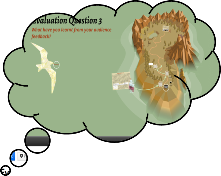
Maya Tyrrell - Evaluation question 3 - What have you learnt from your audience feedback?
I created a mind map to process and present the significance of audience feedback when producing any product that has a target audience.
 |
| This is the full mind map, I will take a closer look at each branch |
 |
| The target audience |
 |
| The different forms of audience feedback |


Maya Tyrrell - Evaluation question 2 - How effective is the combination of your main and ancillary texts?
How effective is the combination of your main and ancillary texts?
All three of my products have synergy and are therefore able to promote one another because of specific similarities that are due to the conventions of the indie genre and the song itself.
The most obvious similarity between the music video, digipak and magazine cover is that they all present the main singer of the band, and therefore audiences can easily recognise that the three products are connected.
Not only does each product promote the lead singer, the actual images used are all linked together. The digipak cover of the singer is featured in the magazine advert and the picture used is of a shot in the music video where he is singing whilst leaning against a tree. Therefore when the digipak or advert are seen it by a consumer it could trigger the memory of this scene in the video and influence the consumer to purchase the CD. This could also work the other way and while watching the music video the viewer would recognise that shot from the advert or digipak and so will appreciate the band are trying to put themselves out there and will be happy to support them.
 |
| The magazine advert |
 |
| The music video |
 |
| The front cover of the digipak |
As well as the common denominator of the singer on each of the products, I also took the autumnal theme from the music video and included it in the magazine advert and the digipak to add a further visual connection between the three products. The music video is set mostly outside where the weather is a big influence on the mood of the video, so the autumn setting, I thought, was very fitting to indicate the change in the protagonist's life and the fallen leaves can represent his fallen relationship. In order to keep this theme across all of the products and to create a further connection between them all, I made sure the leaves from the floor in the music video are on the lyric booklet and in the background of the magazine advert. On the magazine advert this link is slightly more subtle but I am sure that subconsciously the audience viewing the advert will make the link to the music video by recognising the leaves.
 |
| This autumn photo is similar to the walkway the lead singer walks through in the music video |
 |
| This is part of the digipak where the CD goes and is a further attempt to engrave the autumn theme with the song and band so audiences are more likely to remember them. |
Overall I think the products have a shared identity but still each serve their purpose and promote each other. An example of a synergy I have seen in an existing product is in Taylor Swift's album 1989. It has a polaroid cover which links with the lyrics to the song 'out of the woods' and the album title as this was when polaroids were used more commonly than today.
 |
| 1989 album cover, T. Swift |
 |
| Lyrics from "Out of the woods" referencing the polaroid theme |
Comparing my products to this I think I have successfully used synergy and my only improvement would be to edit the lyrics booklet because in comparison to the video and magazine advert it seems more colourful and therefore is a bit too happy for the sad mood of the song.
 |
| The lyrics booklet from the digipak |
Monday, 16 February 2015
Evaluation Question Four - Lydia Duncan
How did you use new technologies in the research, planning, construction and evaluation stages?
 Research
I
used the internet for all aspects of my media project. The two main search
engines that I used to carry out my internet research were ‘Google’ (Microsoft Windows
Computers) and ‘Safari’ (Apple Mac Computers). I used these search engines to
find useful websites for the element of work I was reading into and also to
collect images. Overall I did not find one search engine better than the other
because ultimately they carry out the same function however I will say I am
more at ease with Google because it is the one I use mostly in my everyday
life. When researching ideas and concepts for my music video I had to look into
specific genres of different kinds of music. For this I used the website www.capitalfm.com/london/ as well
as a few others websites. The reason I chose to use this website in particular is
because the radio station ‘Capital’ is one of the biggest up to date local
radio stations meaning that it will have all the latest and most popular music
details. This was vital for my research as it meant that I could see what which
kind of music genres were popular at the time and also which artists were
considered to be “country” (this was the genre I had been allocated to research).
For my digipak and magazine advert I also had to use the internet for research.
I used Google Images in order to find existing products. This was so that I could
start generating ideas of what my own product could be like and to understand
what is seen at appealing visually to an audience so that these particular
products sell.
 I
constructed a PowerPoint when I was analysing some existing music videos. I looked
at three contrasting music videos of high profile artists in order to see if
there were any similarities or differences within their narratives of editing
techniques. Once I had finished the presentations I decided to upload them onto
a website called ‘Slideshare’. This website allowed me to upload my PowerPoints
onto my blog as a flowing presentation instead of still images. I feel this was
a much better way to display my research because it creates interaction between
the viewer and the information at hand making the experience more engaging. As
well as this, within the actual presentations, I further enhanced my use of combining
new technologies by inserting hyperlinks to the music videos I was analysing
and including screenshot images of the specific elements I was referring to. These
two factors helped to hugely illustrate my points.
I
constructed a PowerPoint when I was analysing some existing music videos. I looked
at three contrasting music videos of high profile artists in order to see if
there were any similarities or differences within their narratives of editing
techniques. Once I had finished the presentations I decided to upload them onto
a website called ‘Slideshare’. This website allowed me to upload my PowerPoints
onto my blog as a flowing presentation instead of still images. I feel this was
a much better way to display my research because it creates interaction between
the viewer and the information at hand making the experience more engaging. As
well as this, within the actual presentations, I further enhanced my use of combining
new technologies by inserting hyperlinks to the music videos I was analysing
and including screenshot images of the specific elements I was referring to. These
two factors helped to hugely illustrate my points.  In
order to gain audience feedback we set up a focus group for our target audience.
We showed this focus group an animatic of our storyboard. First, we drew out
the storyboard images and found a white background to place them against. This
was my groups first ever animatic and so we found this task quite tricky as we
had nothing to compare it to. Therefore we observed other groups to see how they went
about it and followed some of their direction. We took a flip camera and
filmed each image for 5 seconds ensuring we had enough space to edit the images
together. Afterwards we downloaded the sections of footage on to a mac desktop
and used the editing software ‘Final Cut Pro’ to create a sequence for our
audience to watch. The music track was inserted into the background so the
asynchronous sound followed the timing of the images. To gauge the
audience’s reactions we used the flip camera again to record what they were
saying and how they responded. We found this very useful because it meant we could
quote our focus group directly and also remember what they all said ensuring we didn't miss anything important. Finally, we edited together the audience's responses and uploaded this as a video on to YouTube to present the information in a clear way.
In
order to gain audience feedback we set up a focus group for our target audience.
We showed this focus group an animatic of our storyboard. First, we drew out
the storyboard images and found a white background to place them against. This
was my groups first ever animatic and so we found this task quite tricky as we
had nothing to compare it to. Therefore we observed other groups to see how they went
about it and followed some of their direction. We took a flip camera and
filmed each image for 5 seconds ensuring we had enough space to edit the images
together. Afterwards we downloaded the sections of footage on to a mac desktop
and used the editing software ‘Final Cut Pro’ to create a sequence for our
audience to watch. The music track was inserted into the background so the
asynchronous sound followed the timing of the images. To gauge the
audience’s reactions we used the flip camera again to record what they were
saying and how they responded. We found this very useful because it meant we could
quote our focus group directly and also remember what they all said ensuring we didn't miss anything important. Finally, we edited together the audience's responses and uploaded this as a video on to YouTube to present the information in a clear way. 
We
used Facebook as part of our research. My group created a Facebook group chat
so that we could communicate with each other when we were working on our
projects outside of lesson hours. We made important decisions within the chat,
for example, picking which unsigned artist we would use. We had a few
suggestions from different people and so we inserted links into the chat so that
every group member could have a listen and provide their opinion. This worked
incredibly well because it meant that no decisions could be made without everyone’s
input and everyone could see what direction we were headed in.
Planning
 With the music video my group were creating we had to plan all the
elements in detail before filming. This meant creating a mood board and an animatic
and organising locations and casting etc. Another member of my group created
the mood board and he ensured that relevant images were collected which were coherent
to an autumn theme. We had picked this theme together at an earlier stage
having noticed that many existing products had an ongoing atmosphere. By doing
this exercise it meant we had a first visual representation of our ideas and we
could see them presented clearly in front of us. I think this also helped our
enthusiasm for the product as the beginning stages were coming together
successfully. I have previously spoken about the animatic we created and the
end result was indeed successful, the feedback we gained both pleased and
helped us. In terms of location we decided to stay in our local area for
convenience. We only had a 2 week time slot for shooting and so we would not
have been able to travel far and collected all our footage in time. The area we
chose was Ealing because we all lived close by and the park matched our
expected mise-en-scene. Casting was challenge for us however, we initially had
a main actor that had agreed to take part yet at the last minute he was not available
for one of the shooting slots and with the time constraints we weren't able to
be flexible with him. This is when we got in touch with another potential actor
who was able to meet the timings. We added him to the Facebook chat our group
was involved in so that we were able to let him know the schedule of events. Social
networks were incredibly valuable to us in this instance.
With the music video my group were creating we had to plan all the
elements in detail before filming. This meant creating a mood board and an animatic
and organising locations and casting etc. Another member of my group created
the mood board and he ensured that relevant images were collected which were coherent
to an autumn theme. We had picked this theme together at an earlier stage
having noticed that many existing products had an ongoing atmosphere. By doing
this exercise it meant we had a first visual representation of our ideas and we
could see them presented clearly in front of us. I think this also helped our
enthusiasm for the product as the beginning stages were coming together
successfully. I have previously spoken about the animatic we created and the
end result was indeed successful, the feedback we gained both pleased and
helped us. In terms of location we decided to stay in our local area for
convenience. We only had a 2 week time slot for shooting and so we would not
have been able to travel far and collected all our footage in time. The area we
chose was Ealing because we all lived close by and the park matched our
expected mise-en-scene. Casting was challenge for us however, we initially had
a main actor that had agreed to take part yet at the last minute he was not available
for one of the shooting slots and with the time constraints we weren't able to
be flexible with him. This is when we got in touch with another potential actor
who was able to meet the timings. We added him to the Facebook chat our group
was involved in so that we were able to let him know the schedule of events. Social
networks were incredibly valuable to us in this instance. 
For the digipak and magazine adverts we already had an idea of
what was needed because of previous existing product research. We chose
different images from our filming and added effects to them for the back and front
covers of our digipak. We used the effect “pencil sketch” for the front cover
which gave it a textured look and then just changed the back image to “grey scale”
for a black and white effect. This was initially done on the PowerPoint editing
tools but the finishing touches were completed on Photoshop. Afterwards we used
a digipak template to cement all the single images together into one design. The
magazine advert was another challenge we came across because our ideas were not
sitting well with our target audience. The first design we had created was on
word but they said the page seemed too simple and wasn't realistic therefore we
went back to the drawing board as a group and used PowerPoint to highlight the
process of the ideas we went through.
Construction
 To film my group used a DSLR camera. In order to use the camera effectively
we had to ensure that we corrected setting such as white balance and exposure
whenever the lighting changed or if we moved location. This meant that when
editing the film looked continuous even if the timings of day were different. It
also guaranteed that the footage was of high quality and wasn't out of focus
for example. To edit I use Final Cut Pro on a Mac desktop. We used the
different transitions and effects this software provided us to help create
atmosphere and to keep the music video running smoothly. The main transition
used was called ‘cross dissolve’. We only used two effects in the whole of
video and these were ‘matched lighting’ and ‘desert glare’. The reason we chose
to match the colour of one shot to another was because the difference between
them was too poignant and looked odd. The second effect was included because it
highlighted a particular pivotal scene within the narrative of our video. The darkened
colour added on top of the argument clips meant that the flash back was easily identified
and also added to the tense and sad atmosphere. In terms of the sound track my
group found the timing difficult. At times our artist’s lip syncing was out of
time with the actual lyrics and so we did have to re shoot some of the shots
which took up more time. Eventually we managed to piece together the track and
the footage manually. We were not able to use the ‘spot technique’ that
automatically matched the sound and this was because our filming was often too
quite. Doing it by ourselves though wasn't unsuccessful and the audience did
not have any problems.
To film my group used a DSLR camera. In order to use the camera effectively
we had to ensure that we corrected setting such as white balance and exposure
whenever the lighting changed or if we moved location. This meant that when
editing the film looked continuous even if the timings of day were different. It
also guaranteed that the footage was of high quality and wasn't out of focus
for example. To edit I use Final Cut Pro on a Mac desktop. We used the
different transitions and effects this software provided us to help create
atmosphere and to keep the music video running smoothly. The main transition
used was called ‘cross dissolve’. We only used two effects in the whole of
video and these were ‘matched lighting’ and ‘desert glare’. The reason we chose
to match the colour of one shot to another was because the difference between
them was too poignant and looked odd. The second effect was included because it
highlighted a particular pivotal scene within the narrative of our video. The darkened
colour added on top of the argument clips meant that the flash back was easily identified
and also added to the tense and sad atmosphere. In terms of the sound track my
group found the timing difficult. At times our artist’s lip syncing was out of
time with the actual lyrics and so we did have to re shoot some of the shots
which took up more time. Eventually we managed to piece together the track and
the footage manually. We were not able to use the ‘spot technique’ that
automatically matched the sound and this was because our filming was often too
quite. Doing it by ourselves though wasn't unsuccessful and the audience did
not have any problems.  In the construction of my digipak I used PowerPoint and Photoshop.
PowerPoint was mainly used to crop and change the sizes of the 6 images I was
using to ensure that they all fit together evenly after being edited. With PowerPoint
I also used the image edit tool bar to add light to some dark areas however Photoshop
was used to change the overall effects. The two main images (front and back
covers) were made black and white but the other 4 images were kept the same
with their colours just slightly more exposed. For the magazine advert I made I
used the same tools but added a lot more detail. For example, the digipak only
had 6 original images yet the advert we were constructing had our own images
plus externally sourced images from Google images for example. The logos of
well-known music magazine were retrieved from Google.
In the construction of my digipak I used PowerPoint and Photoshop.
PowerPoint was mainly used to crop and change the sizes of the 6 images I was
using to ensure that they all fit together evenly after being edited. With PowerPoint
I also used the image edit tool bar to add light to some dark areas however Photoshop
was used to change the overall effects. The two main images (front and back
covers) were made black and white but the other 4 images were kept the same
with their colours just slightly more exposed. For the magazine advert I made I
used the same tools but added a lot more detail. For example, the digipak only
had 6 original images yet the advert we were constructing had our own images
plus externally sourced images from Google images for example. The logos of
well-known music magazine were retrieved from Google. Evaluation
 The final music video
was uploaded onto the video sharing social network, YouTube. This allows anyone
who uses this website to view our projects and leave comments, it is an interactive
medium. The comment section allowed us to see how successful our final media product
was because our target audience were able to get back to us. In terms of my
overall evaluation I have used many different new technologies and mediums to
present my information. For my first question I created a PowerPoint. I initially
uploaded this onto Slideshare to I could present as a flowing show however the
bottom bar covered the concluding parts of my paragraphs and so I had to change
this and take screenshot of each slide and upload them in a sequence of images
and annotations. Between these slides I also inserted hyperlinks to YouTube
videos which were examples helping to illustrate my points. My second
evaluation question was a podcast. This meant I used my iMac laptop and used iMovie
to create it. The podcast was a combination of moving images and text with my
voice over. I had to write a narration and record myself reading aloud so that I
could add images to the track. Some of the images were relent ones taken from
Google but I also included clips and images from my own music video so that I could
annotate them and provide specific examples. Finally, the third evaluation
question was presented using the provider Prezi. This is similar to PowerPoint
but more interactive and engaging for an audience. It includes images, film
clips, quotes and text so it is very visual and informative.
The final music video
was uploaded onto the video sharing social network, YouTube. This allows anyone
who uses this website to view our projects and leave comments, it is an interactive
medium. The comment section allowed us to see how successful our final media product
was because our target audience were able to get back to us. In terms of my
overall evaluation I have used many different new technologies and mediums to
present my information. For my first question I created a PowerPoint. I initially
uploaded this onto Slideshare to I could present as a flowing show however the
bottom bar covered the concluding parts of my paragraphs and so I had to change
this and take screenshot of each slide and upload them in a sequence of images
and annotations. Between these slides I also inserted hyperlinks to YouTube
videos which were examples helping to illustrate my points. My second
evaluation question was a podcast. This meant I used my iMac laptop and used iMovie
to create it. The podcast was a combination of moving images and text with my
voice over. I had to write a narration and record myself reading aloud so that I
could add images to the track. Some of the images were relent ones taken from
Google but I also included clips and images from my own music video so that I could
annotate them and provide specific examples. Finally, the third evaluation
question was presented using the provider Prezi. This is similar to PowerPoint
but more interactive and engaging for an audience. It includes images, film
clips, quotes and text so it is very visual and informative. Evaluation Question Two - Lydia Duncan
How effective is the combination of you main and ancillary texts?
Subscribe to:
Posts (Atom)